Skip to content Skip to sidebar Skip to footer

Unveiling the Top 5 Box Shadow Generators to Elevate Your Designs in 2024

Hey CSS champs! Ready to add some magic to your web elements? Check out our top 5 Box Shadow Generators for 2024. These tools make it super easy to create cool shadows for your buttons, boxes, and more. Let’s dive in and level up your design game!

  1. CSSGenerator: Box shadow Generator
  2. CSSmatic: All-in-One CSS Solution
  3. Neumorphism.io: Embracing the Neumorphic Trend
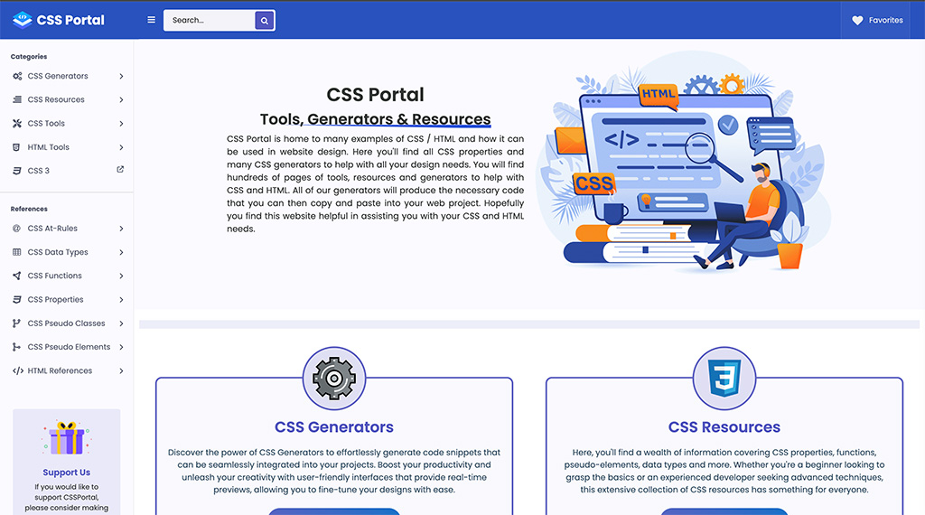
  4. CSSPortal: Simple and Effective
  5. GetCSSScan: Beyond Box Shadows

Here is Our Css Box Shadow Generator you can check.

  1. CSSGenerator: Box shadow Generator

A box-shadow CSS generator that helps you quickly generate box-shadow CSS declarations for your website. It comes with many options and it demonstrates instantly. Explore additional CSS tools like Box Shadow CSS, Text Shadow CSS, Cursor, Border, Border Radius, Gradient CSS, Transform CSS, RGBA & Hex Color, Multiple Columns, and Filter etc.

  1. CSSmatic: All-in-One CSS Solution

Streamline your design process with this comprehensive CSS solution.

  1. Neumorphism.io: Embracing the Neumorphic Trend

Dive into the neumorphic design trend with Neumorphism.io. This generator specializes in creating soft, realistic shadows, adding a touch of modern elegance to your user interfaces.

  1. CSSPortal: Simple and Effective

CSSPortal’s Box-Shadow Generator is a straightforward yet powerful tool. Adjust parameters and witness instant code generation, making it an ideal choice for those who appreciate simplicity.

5. GetCSSScan: Beyond Box Shadows

Explore shadows alongside other CSS styles, ensuring a cohesive design language.

Time to get creative, pals! These Box Shadow Generators are here to make your designs pop. Dive in, try them out, and let your web elements shine in 2024. Happy styling!

Leave a comment

Mastering Centering Navbar Content in Bootstrap 3

Introduction

Bootstrap 3 has revolutionized web design offering a comprehensive framework for creating responsive websites. One key element of a visually appealing website is a well-centered navbar content. In this article, we will delve into the importance of centering navbar content, explore different techniques to achieve this, and provide insights on ensuring responsiveness.

Understanding Bootstrap Navbar

Explanation of Navbar Components

The navbar in Bootstrap is a versatile component that allows for easy navigation on websites. It typically contains links, buttons, and other elements that help users navigate through the site.

Default Alignment of Navbar Content

By default, the content in a Bootstrap navbar is aligned to the left, which may not always be visually pleasing or practical for all designs.

Common Issues with Navbar Alignment

One common issue with navbar alignment is the lack of centered content, which can disrupt the overall aesthetic of the website.

Centering Navbar Content Manually

Step-by-Step Guide to Manually Centering Content

To manually center navbar content in Bootstrap, you can use CSS to adjust the alignment of the elements. copy this code and use it.

@media (min-width: 768px){
    .navbar-collapse.collapse {
    display: flex !important;
    align-items: center;
    justify-content: space-between;
}

Tips for Ensuring Responsiveness

When manually centering navbar content, ensure that the design remains responsive by testing it on different devices and screen sizes.

Advantages and Limitations of Manual Centering

While manual centering provides flexibility and control over the design, it can be time-consuming and may require additional effort to ensure responsiveness.

Utilizing Bootstrap Classes for Centering

Overview of Bootstrap Classes for Centering

Bootstrap offers a range of classes that can be used to center navbar content, such as navbar-center.

How to Apply Classes to Center Content

By applying the appropriate Bootstrap classes to the navbar elements, you can easily center the content without the need for manual adjustments.

Customization Options for Centered Navbar Content

Bootstrap allows for customization of centered navbar content through the use of additional CSS styles and classes.

Advanced Techniques for Centering Navbar Content

Using Flexbox for Centering

Flexbox is a powerful layout tool that can be used to center navbar content efficiently and effectively.

Exploring Different Layout Options

By experimenting with different layout options, such as flex-direction and justify-content, you can create unique centered designs for your navbar.

Troubleshooting Common Issues with Centering Techniques

If you encounter issues with centering techniques, such as overlapping elements or misaligned content, you can troubleshoot by adjusting CSS properties.

Demo

Conclusion

In conclusion, mastering centering navbar content in Bootstrap 3 is essential for creating visually appealing and user-friendly websites. By understanding the importance of centering, leveraging Bootstrap classes, and exploring advanced techniques, you can enhance the design of your website and improve the overall user experience.

FAQs

  • How do I center navbar content without Bootstrap?
  • Can I customize the centering of navbar content in Bootstrap?
  • How can I ensure my centered navbar content is responsive on all devices?

Remember, a well-centered navbar not only improves the aesthetics of a website but also enhances user experience. So, next time you design a website using Bootstrap 3, don’t forget to master the art of centering navbar content!

Leave a comment

Simple Custom Tab Design with HTML, CSS, and JavaScript.

Hey there, fellow web enthusiasts! Today, I’m excited to share a quick and easy way to elevate the user experience on your website by adding a sleek custom tab design. Follow along as we use HTML, CSS, and JavaScript to achieve this stylish enhancement.


Let’s start by creating the HTML structure. We’ll need a container for our tabs and the content associated with each tab. Here’s a basic example:

 
<div class="tab-container">
  <ul id="myTabs" class="tabs">
    <li data-tab="tab1" class="active">HTML</li>
    <li data-tab="tab2">CSS</li>
    <li data-tab="tab3">Javascript</li>
    
  </ul>

  <div id="tabContent">
    <div id="tab1" class="tab-content active-tab">
      <p>HTML</p>
    </div>
    <div id="tab2" class="tab-content">
      <p>CSS</p>
    </div>
    <div id="tab3" class="tab-content">
      <p>JavaScript</p>
    </div>
    
  </div>
 </div>

Styling with CSS
Now, let’s add some style to our tabs. Create a styles.css file and add the following:

 .tab-content {
      display: none;
    }

    .active-tab {
      display: block;
    }

    .tabs {
       border-bottom: 1px solid #ddd;
    margin: 0;
    padding: 0;
    }

    .tabs li {
      display: inline-block;
    cursor: pointer;
    padding: 8px 16px;
    margin: 0;
    }
 
    .tabs li.active {
      background-color: #007bff;
      color: #fff;
    }

JavaScript Magic
Lastly, let’s add the JavaScript functionality to switch between tabs:

 document.addEventListener('DOMContentLoaded', function () {
      // Get all tabs and tab content
      const tabs = document.querySelectorAll('#myTabs li');
      const tabContents = document.querySelectorAll('.tab-content');

      // Add click event listener to each tab
      tabs.forEach(tab => {
        tab.addEventListener('click', function () {
          // Remove 'active' class from all tabs and tab contents
          tabs.forEach(t => t.classList.remove('active'));
          tabContents.forEach(content => content.classList.remove('active-tab'));

          // Add 'active' class to the clicked tab and corresponding tab content
          const tabId = this.getAttribute('data-tab');
          const activeTab = document.getElementById(tabId);

          this.classList.add('active');
          activeTab.classList.add('active-tab');
        });
      });
    });

I hope this artical is helpful for you. If it helps and you find it useful, please write a comment to let us know. You can also buy me a coffee as a gesture of appreciation. Thank you!

Leave a comment

Free Responsive Mega Menu Code Drop

Looking for a free responsive mega menu? Look no further! I’ve got you covered with a fantastic freebie – a fully responsive mega menu code! Use it freely to enhance your website’s navigation on any device. Check out the simple integration steps and elevate your user experience effortlessly. Dive into seamless navigation now.

You can see the code pen version in below link
Responsive Mega Menu

But you can find the finest version in the download and demo.

You can see the code pen version in below link
Responsive Mega Menu

I hope this artical is helpful for you. If it helps and you find it useful, please write a comment to let us know. You can also buy me a coffee as a gesture of appreciation. Thank you!

Leave a comment

Changing Bootstrap 4 Navbar Collapse Breakpoint

Changing the navbar breakpoint in Bootstrap 4 is a straightforward process with the use of the “navbar-expand-*” classes. These classes determine when the mobile menu should be displayed based on screen size.

For example, by adding the class “navbar-expand-sm” to the <nav> element, the mobile menu will appear on extra small screens with a width less than 576 pixels. Similarly, “navbar-expand-md”, “navbar-expand-lg”, and “navbar-expand-xl” control the visibility of the mobile menu on small, medium, and large screens respectively.

To always display the mobile menu regardless of screen size, exclude any “navbar-expand-*” classes. On the other hand, if you want to create a custom breakpoint at a specific width (e.g., 1024), you can utilize CSS to achieve this. The code snippet provided demonstrates how to accomplish this customization.

Overall, understanding and implementing these techniques will allow you to effectively control when and how your navbar responds to different screen sizes. For a visual representation of all six navbar states mentioned above, please refer to this demo example: [bootstrap-4-navbar-example-link].navbar-expand-sm = mobile menu on xs screens <576px

  • navbar-expand-md = mobile menu on sm screens <768px
  • navbar-expand-lg = mobile menu on md screens <992px
  • navbar-expand-xl = mobile menu on lg screens <1200px
  • navbar-expand = never use mobile menu
  • (no expand class) = always use mobile menu

If you exclude navbar-expand-* the mobile menu will be used at all widths. Here’s a demo of all 6 navbar states: Bootstrap 4 Navbar Example

@media (min-width: 1024){

    .navbar-expand-custom {

        flex-direction: row;

        flex-wrap: nowrap;

        justify-content: flex-start;

    }

    .navbar-expand-custom .navbar-nav {

        flex-direction: row;

    }

    .navbar-expand-custom .dropdown-menu {

        position: absolute;

    }

    .navbar-expand-custom .nav-link {

        padding-right: .5rem;

        padding-left: .5rem;

    }

    .navbar-expand-custom > .container {

        flex-wrap: nowrap;

    }

    .navbar-expand-custom .navbar-collapse {

        display: flex!important;

        flex-basis: auto;

    }

    .navbar-expand-custom .navbar-toggler {

        display: none;

    }

}

If you use it on bootstrap 3 Read this : Changing Bootstrap 3 Navbar Collapse Breakpoint 992: A Quick Guide

I hope this code is helpful for you. If it helps and you find it useful, please write a comment to let us know. You can also buy me a coffee as a gesture of appreciation. Thank you!

Leave a comment

Changing Bootstrap 3 Navbar Collapse Breakpoint 992: A Quick Guide

The navigation bar (navbar) is a critical element in creating visually appealing and responsive web designs, and Bootstrap 3 offers a popular front-end framework for this purpose. By default, the navbar collapse breakpoint in Bootstrap 3 is set at 992 pixels. However, in this comprehensive guide, we will provide you with step-by-step instructions on how to modify this breakpoint to better align with your specific project requirements.

If you are using Bootstrap 3.3.x, you can modify the CSS code below to set the breakpoint for the navbar collapse. Simply replace “991px” with your desired pixel dimension to achieve the desired effect:

@media (max-width: 991px) {
  .navbar-header {
      float: none;
  }
  .navbar-left,.navbar-right {
      float: none !important;
  }
  .navbar-toggle {
      display: block;
  }
  .navbar-collapse {
      border-top: 1px solid transparent;
      box-shadow: inset 0 1px 0 rgba(255,255,255,0.1);
  }
  .navbar-fixed-top {
      top: 0;
      border-width: 0 0 1px;
  }
  .navbar-collapse.collapse {
      display: none!important;
  }
  .navbar-nav {
      float: none!important;
      margin-top: 7.5px;
  }
  .navbar-nav>li {
      float: none;
  }
  .navbar-nav>li>a {
      padding-top: 10px;
      padding-bottom: 10px;
  }
  .collapse.in{
      display:block !important;
  }
}

If you use it on bootstrap 4 https://cssstuffs.com/changing-bootstrap-4-navbar-collapse-breakpoint/

I hope this code is helpful for you. If it helps and you find it useful, please write a comment to let us know. You can also buy me a coffee as a gesture of appreciation. Thank you!

Leave a comment